Components In React

Hello 🤝, I love to build products using Mern Stack 👨🏻💻. Meanwhile, I write blogs of my daily learnings to keep track of them and share it with everyone here at Hashnode.
Apart from these, I love to read blogs, non-fiction books, and short stories.
We all rode bicycles to school when we were kids, some of us still have it right 🚲? Those moments 🤩. Well, the point is every bicycle has its own pair of wheels, handle, spokes, brakes, seat, pedals, chains, and more. One cannot manufacture a bicycle directly without manufacturing its standalone components in the first place i.e. those mentioned above. All these components get manufactured and they all get assembled to make a complete bicycle.
Similarly, almost all products are made from small basic components including us ✌🏻. May it be a physical product or a digital one. The principles are same for everyone.
In the same way, a website or a web app can get split into multiple components like buttons, small containers, cards, breadcrumbs, modals etc. and all in combination gives us beautiful digital products that we interact with on the Internet 👇🏻. Components are nothing but a part of UI in our app.
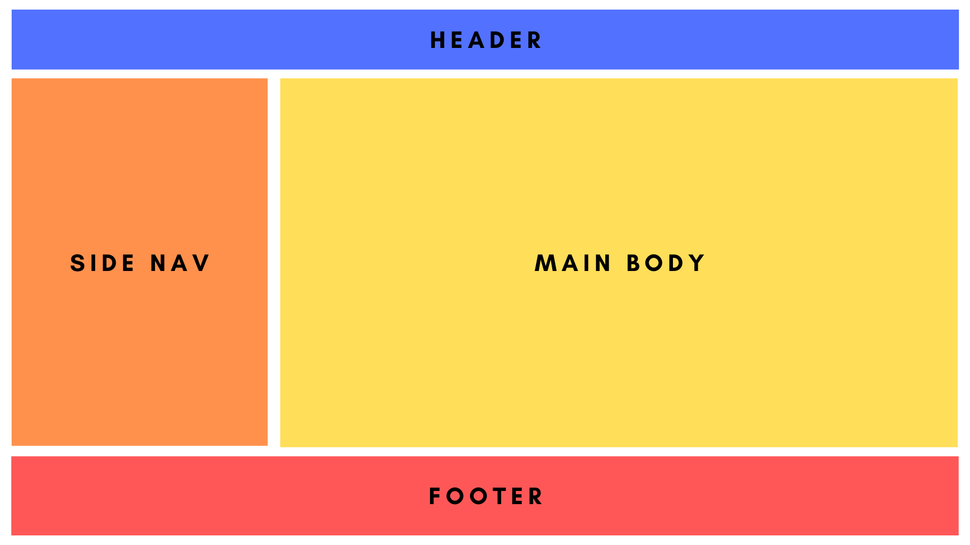
Again a component can be divided into multiple small components 👇🏻. Header component further divided into a blue container and orange buttons. So, we can make these components separately and use them any number of times.

Components are reusable.
Component Types
- Stateless Functional Components
- Regular JavaScript functions.
- They simply return Html.
- These components are simple and easy to use.
- They do not maintain their own data.
- No worries about
thiskeyword. - They can receive
props(properties).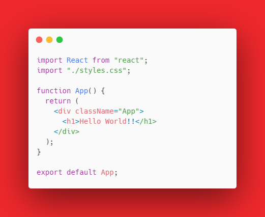
- Stateful Class Components
- Regular ES6 classes that extend to Component class from React library.
- They contain a
rendermethod which returns Html. - These components are feature-rich.
- They maintain their own private data referred to as
state. - Props are accessible via
this.props. - They provide access to lifecycle methods.
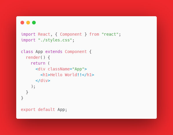
Both snippets above will return the same output
Hello World!!.
Note
Hooks were introduced to React in version 16.8. So now React can have functional components that are not actually stateless. Now they can have their own states and can have access to lifecycle methods using Hooks.
Application
Now it's time to get our hands dirty with a small demo-app by making small components and using them to make a meaningful product.
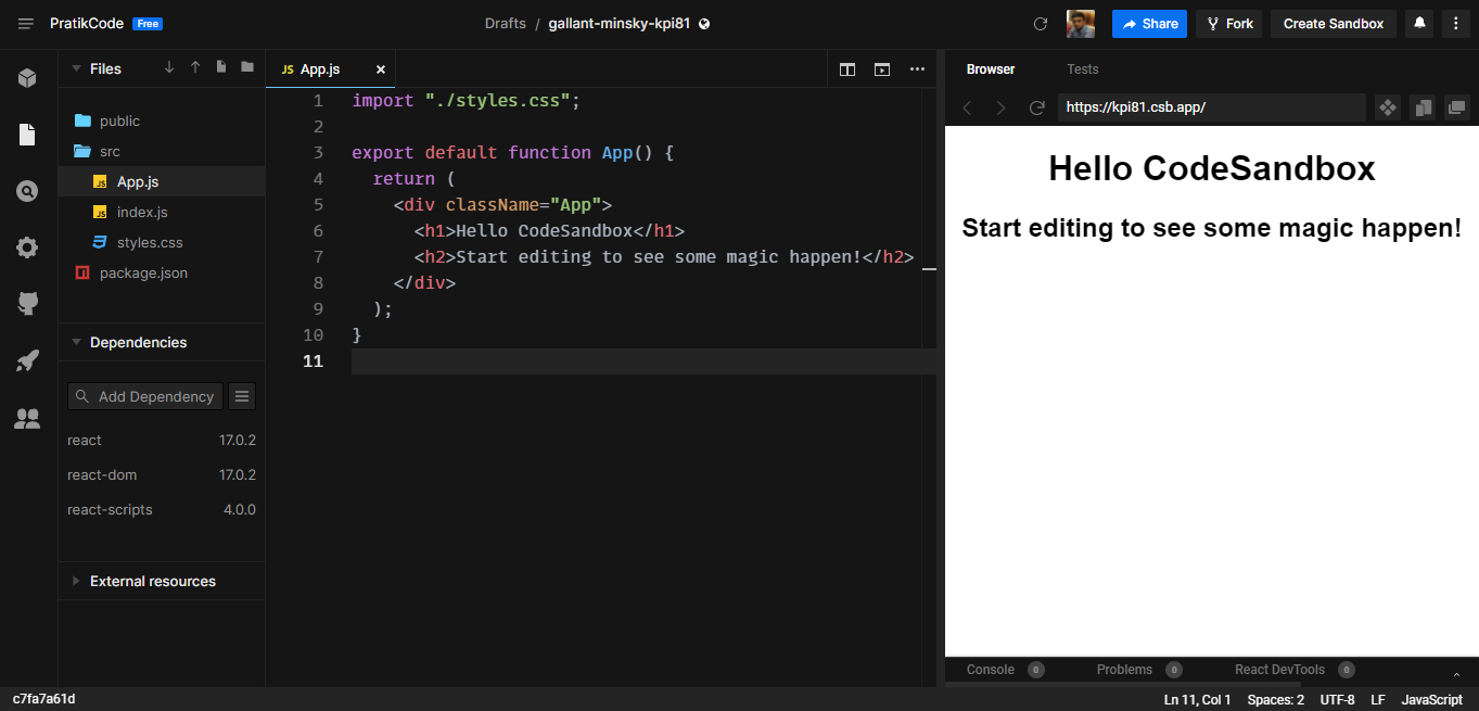
- => Using CodeSandbox for this project.
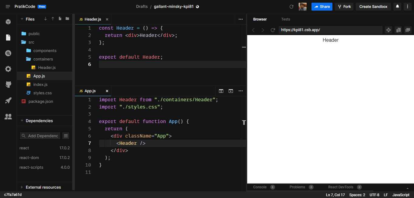
Initial look 👇🏻
- => Inside the
srcfolder we make two folders containers and components for easy access. - => Inside
containers. Make a Header.js file. - => Remember to import this file into App.js to use it.
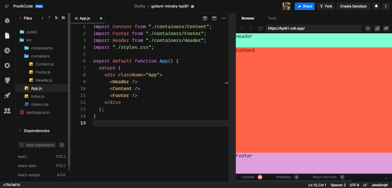
- => Now make Header, Content, and Footer containers and style them a bit so that they look less ugly 😀. And import all inside App.js
// inside Header.js
const Header = () => {
  return <div className="header">Header</div>;
};

export default Header;

--------------------------------------

// inside Content.js
const Content = () => {
  return <div className="content">Content</div>;
};

export default Content;

--------------------------------------

// inside Footer.js
const Footer = () => {
  return <div className="footer">Footer</div>;
};

export default Footer;
// inside styles.css
.App {
  font-family: monospace;
  font-size: 1.1rem;
}

* {
  margin: 0;
  padding: 0;
}

.header {
  width: 100%;
  height: 10vh;
  background-color: aquamarine;
}

.content {
  width: 100%;
  height: 75vh;
  background-color: tomato;
}

.footer {
  width: 100%;
  height: 15vh;
  background-color: plum;
}
- => Now it should like this 👇🏻
- => These containers will hold our components. Now we are done with containers lets build standalone components.
- => Inside the components folder, we'll make
ButtonandCardcomponents.
// inside Button.js
const Button = () => {
  return <button className="button">Button</button>;
};

export default Button;
// inside styles.css
.button {
  width: auto;
  padding: .3rem .6rem;
  background-color: white;
  border-style: none;
  cursor: pointer;
}
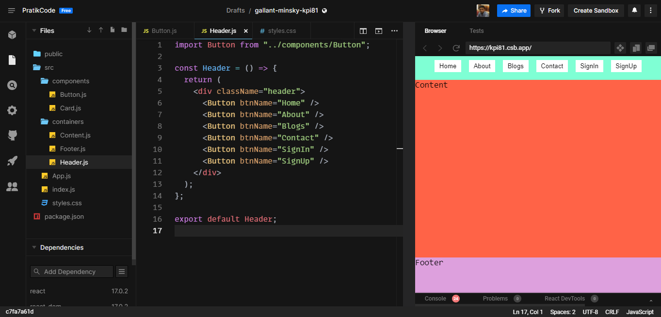
- => Import Button component inside Header container.
- => So Header is parent and Button is a child to it.
import Button from "../components/Button";

const Header = () => {
  return (
    <div className="header">
      <Button />
    </div>
  );
};

export default Header;
- => Now, there is a term
propsthat we use to send properties from parent to child components. - => We'll discuss props in the next article. For now, we just need to know that the Button component must be dynamic so that we change its name and use it wherever we want. We'll be passing
btnNameas properties (or props).
// inside Header.js
import Button from "../components/Button";

const Header = () => {
  return (
    <div className="header">
      <Button btnName="Home" />
    </div>
  );
};

export default Header;

--------------------------------------

// inside Button.js
const Button = (props) => {
  return <button className="button">{props.btnName}</button>;
};

export default Button;
- => Now our Button component is dynamic.
- => We can use the same Button component any number of times by passing props.
- => At this point it should look like this 👇🏻.
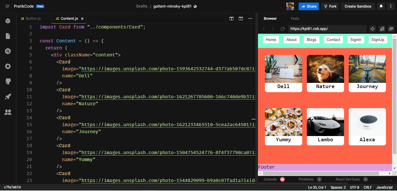
- => Making a
Cardcomponent.Remember 👉🏻 wherever we want to have dynamic content, wrap them with curly braces and pass properties.
// inside Card.js
const Card = (props) => {
  return (
    <div className="card">
      <img className="card-image" src={props.image} alt="img" />
      <div className="card-name">{props.name}</div>
    </div>
  );
};

export default Card;
//inside styles.css
.card {
  width: 8rem;
  height: 8rem;
  margin: 0.5rem;
  border-radius: 0.5rem;
  overflow: hidden;
  display: flex;
  flex-direction: column;
  align-items: center;
  background-color: white;
}

.card-image {
  width: 100%;
  height: 6rem;
  object-fit: cover;
}

.card-name {
  font-size: 1.2rem;
  font-weight: 700;
}
- => Now that we have the
Cardcomponent, import it inside theContentcontainer. - => Now we can pass the different name and image URLs.
That's it. Now we have understood what are components, why to use them, and how to use them. Thank you for holding with me until now 🙃.
Images used in demo-app are from Unsplash and credit goes to their respective owners.
CodeSandbox link to demo-app https://codesandbox.io/s/gallant-minsky-kpi81

